Grand Bell Suites
Unbound Productions tasked me with creating the identity for this new development, all-encompassing solution to condo living. It will be central to Wilfrid Laurier University, with lush green spaces, close to shopping centres, transit, and the city’s hotspots.
When designing the branding for this project, it was important to think about how to best reflect this new thoughtful community and consider it’s end-users at every step of development. The brand was designed to continue to evolve to best reward those who live and invest in Grand Bell Suites.
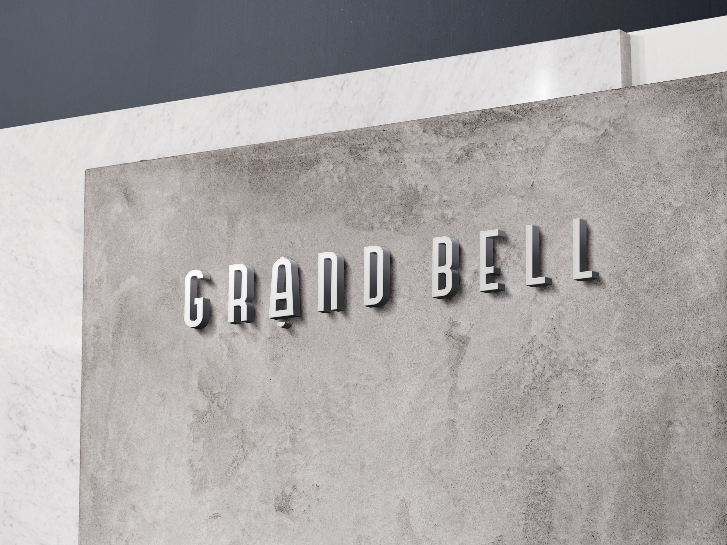
Logo

The is subtle insertion of the bell within the “A” follows the same flow of the rest of the typography. The bell graphic can also be easily recognizable on its own and can be used for a favicon, social media profiles and avatars.
Colour Palette
The nautical colour palette helps tie in the aquatic and natural element of the Grand River. The primary blue helps calm and identifies with trust, loyalty, confidence and intelligence while the tertiary blues and khaki colour help add a bit more flexibility and diversity to the colour palette.

Typography
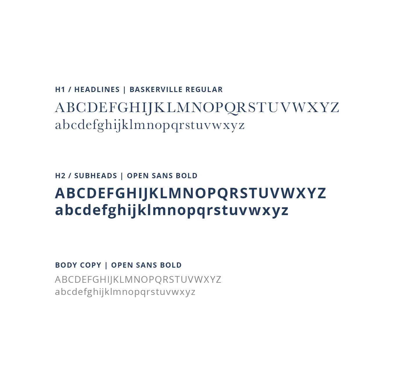
The typography was chosen to help reflect the brand’s unique offering. Baskerville is a more traditional font that reflects history, expertise and demonstrates trust to the viewer. This speaks to Brantford’s historic accomplishments and the trust the brand desires from it’s investors.
Open Sans helps add a bit of diversity to each layout when paired with the serif headline font. It also is highly legible on screen and at small sizes.


